B2B CONTENT MARKETING - DIGITAL DESIGN
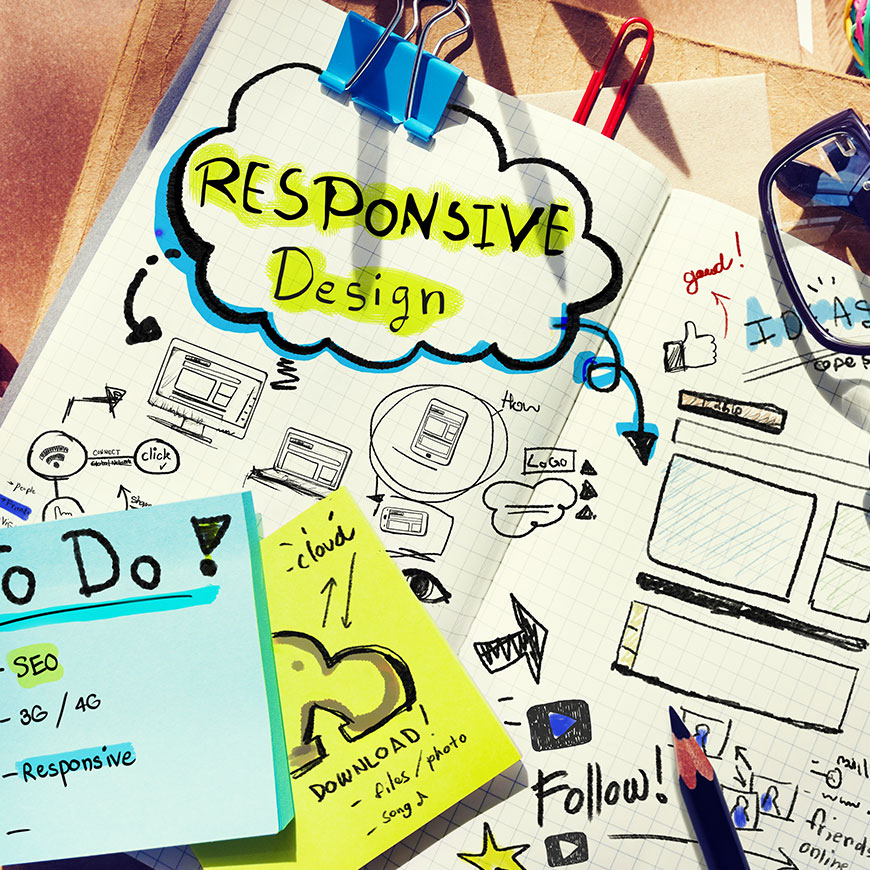
Why you need responsive design in all your online marketing
With 60% of internet access now made via a mobile device (Inmobi), adopting a responsive web design is fast becoming a business imperative. Google states that responsive web design – one that enables users to have an optimised experience irrespective of device – is its recommended configuration, and even goes so far as to refer to responsive web design as the industry best practice.
Responsive design practice consists of a mix of flexible grids and layouts, images and an intelligent use of CSS. As people use multiple devices to engage with the brand, the website will automatically adapt to accommodate for resolution, image size, scripting abilities and users preferences. This eliminates the need for a different design and development phase for each new gadget on the market – a challenge that even the best of us struggle to keep up with!
In this article written by Kristi Hines she examines ‘How responsive design increases the results of your online marketing’ and says, “As marketers we sometimes only focus on the specific tasks, such as creating content, developing email campaigns, building links, and updating social media networks. The fact of the matter is, if you or your clients do not have a responsive design in place, then all of the online marketing strategies we implement will not bring the full potential of results...”
So how can responsive design help?
We want everyone to have the same brand experience and consistency across all devices. Typically, the mobile version includes a limited number of the many pages that are displayed on your desktop version. However, it will include a link to your full desktop website so that visitors have the option to find additional content.
A responsive website is good for SEO; sites built on responsive web design have one URL which makes it easier for Google to crawl and index content. If these sites are compared to sites that have different URLs and different HTML, responsive web design emerges as the winner. Responsive web design delivers an improved user experience (UX) as it’s easier for mobile users to interact with content that is on one page. From a practical point of view, managing one site and one SEO campaign requires less effort and resource than handling multiple sites.
Other benefits are identified in the context of a typical marketing campaign including:
Content Marketing
Whilst people are reading your blog posts, not only will they be able to read it on their mobile device, but they will also be able to use your social sharing buttons.
Email Marketing
When people open an email with a responsive template, they will be able to read it no matter what device they use. Most importantly, when they click on a link from that email, if the website design is also responsive, they will have no problems browsing the website.
Search Marketing
If people click on a link to your website from search results they will be able to get to that page and consume the information they need.
Social Media Marketing
When customers click on a promoted offer from your Facebook page on their mobile device, they’ll be able to purchase the promoted item just like they would on their desktop browser.
51% of emails are opened on mobile devices, 70% of mobile searches lead to action on websites within an hour – which marketers ignore at their peril. If we want to increase the results of our online marketing campaigns, responsive design is a must. Check out the Google analytics on your current website and the results are likely to show significant increase in mobile traffic as each year passes. The importance of delivering marketing messaging that caters to, and targets, mobile device users cannot be overstated.
<<< Back to Blog


